

LOGOFOLIO
2026
YEAR
A collection of logo designs focused on clarity, versatility, and strong visual identity. Each mark is built with intention—balancing form, typography, and concept to create designs that are both memorable and functional.
BRANDING
TYPOGRAPHY
ART DIRECTION
LOGO DESIGN

ABOUT THE PROJECT
A collection of original logo designs and select redesigns spanning a range of industries from physical therapy and restaurants to tattoo shops and cycling. Each mark is built to work hard: clear at any size, distinct in its category, and grounded in a strong visual thinking.
THE APPROACH
Every project starts with the industry, not the trend. The goal is to understand what a business needs to communicate before touching a single shape. From there, the focus stays on simplicity and marks that don't rely on complexity to feel complete, and that hold up whether they're on a storefront, a business card, or a screen.


LOGO REDESIGN: SUMMIT PEAK PT

BEFORE
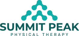
AFTER
The original mark leaned on a generic medical badge; busy, dated, and hard to scale. The redesign strips it back to what the name actually says: peaks. Three interconnected triangles reference both mountain summits and the body in motion, while the clean wordmark lets the symbol do the talking. The result feels clinical enough to trust, active enough to remember.
EXPLORATION OPTIONS


LOGO REDESIGN: NEW YORK EATS

BEFORE
AFTER

The original had charm but no clarity. Tthe badge shape and skyline illustration competed with the name. The redesign leans into boldness. A stacked, high-contrast wordmark puts the brand front and center, while the color palette keeps the NYC energy without the noise. Less souvenir, more brand.
EXPLORATION OPTIONS
