PGN SKATE CO.
2026
YEAR
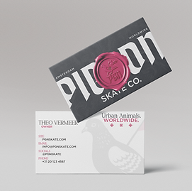
A brand language fusing medieval archival typography with contemporary skate aesthetics, applied across boards, hardware, apparel, packaging, and stationery.
BRANDING
PACKAGING
TYPOGRAPHY
ART DIRECTION

ABOUT THE PROJECT
The visual system combines traditional European influences such as medieval and archival typography with contemporary skate aesthetics to create a distinctive and adaptable brand language.
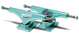
The project includes a full ecosystem of applications across boards, hardware, apparel, packaging, and stationery, emphasizing consistency, realism, and scalability.
THE APPROACH
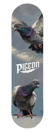
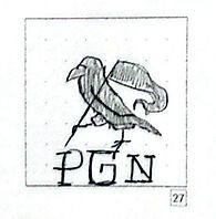
The direction fused medieval manuscript culture blackletter, wax seals, heraldic illustration with the raw physicality of street skating.
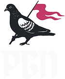
Every touchpoint was treated as an artifact: something made to exist in the real world, worn in, carried across cities. The pigeon isn't a mascot. It's an emblem for anyone who moves through concrete and finds their own ground.


COLOR PALLET

TYPOGRAPHY

PRIMARY - KONFUS
BODY - GOTHAM MEDIUM